

What a corporate website needs to help buyers choose a supplier
Help the buyer compare and take the next step
A corporate website helps buyers choose a supplier when it explains the problems the company solves, who the service suits, what supports its claims and how to start a conversation. That requires connected service pages, credible evidence, clear working arrangements and a functioning enquiry route. Start with buyer questions, define the page structure and acceptance criteria, then use design to make that journey easier.
- Explain specific services and the limits of responsibility.
- Support claims with material the reader can assess.
- Describe the process, required inputs and next step.
- Test enquiries on both phones and computers.
Map the decision before drawing the pages
A director, procurement lead and technical specialist may visit the same website with different concerns. One wants to understand business fit, another needs a comparable scope, and the third checks constraints and compatibility. Collect the questions that appear in actual calls and emails: what is included, what is needed for an estimate, who approves the work and what happens after launch.
Corporate website development should begin with this decision map. An equipment maintenance company, for example, could explain supported systems, diagnostic scope and the enquiry process instead of relying on “complete solutions”. This is a hypothetical planning example, not an AV Group client. Give every important question an obvious page or a clear section that answers it.
For a business operating in Moldova, decide which content buyers need in Romanian and Russian. For international work, identify the actual markets and languages rather than assuming one version serves every country. Do not create city pages with identical copy. Before requesting company website design, gather the service list, audiences and available evidence so the estimate reflects the actual work.
Build the structure around services
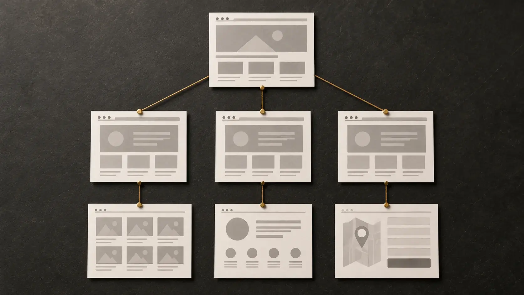
The homepage explains the proposition and directs visitors to the right subject. A service page addresses one specific need. Company information establishes who is responsible, while the contact page makes the next action clear. Add a blog when there are questions worth answering in detail; an empty section does not improve the buying experience.
| Page | Buyer’s question | Material to prepare |
|---|---|---|
| Homepage | Is this company relevant to my problem? | Services, audience, concise evidence and clear routes |
| Service | What is included and how is it estimated? | Scope, exclusions, stages and required inputs |
| Experience | Can I assess the claimed expertise? | Real work, the team’s role and approved evidence |
| Company | Who will take responsibility? | Verified information and working arrangements |
| Contact | How do I begin and what should I send? | Available channels, form and explanation of the next step |
A separate service page is useful when the buyer’s problem, deliverables and selection criteria differ. If only the name changes, strengthen the shared page instead. Avoid hiding every service inside one lengthy page merely to reduce the page count. Record the first-release scope and deferred sections in a website requirements brief.
Describe the service in terms buyers can evaluate
A useful service page lets a prospective customer prepare a meaningful enquiry. Explain who it is for, what is delivered, what the work covers and what is charged separately. If pricing depends on scope, identify the estimating factors: page types, languages, content migration, integrations and ongoing support. A “request a price” button cannot replace that explanation.
Describe how the engagement works: the customer’s inputs, decision makers, intermediate approvals and the handling of changes. Name an observable deliverable for each stage, such as an approved structure, a populated section or a tested form. Publish firm prices and delivery promises only when current business terms support them.
A business website redesign needs more than an attractive opening screen. Visitors should move from the general offer to the relevant service, understand its limitations and find an action that matches their situation. That action might be discussing requirements or sending source material rather than immediately requesting a purchase. Explain what to include so the first conversation can be productive.
Make limited evidence credible rather than inflated
A case study is useful when it explains the initial problem, the team’s responsibility, the work completed and a substantiated outcome. A screenshot alone shows appearance, not authorship or business impact. Results expressed as numbers need a time period, source and context. If outcomes are confidential, describe the approved process and deliverables without inventing percentages.
If public case studies are unavailable, provide a clearly labelled demonstration, a sample document, a testing method or verified professional capabilities. These help a buyer assess the approach, but do not prove a commercial track record. Do not present a training mock-up as client work or use another organisation’s logo to imply a relationship.
- Confirm permission to publish names, images and testimonials.
- Explain precisely what the team delivered and what it did not control.
- Connect evidence to the service it actually supports.
- Review older material when the current offer changes.
A small amount of assessable evidence is more useful than a large portfolio without context. It gives buyers a basis for specific questions and helps the supplier avoid expectations that its proposal does not cover.
Treat the enquiry as a complete process
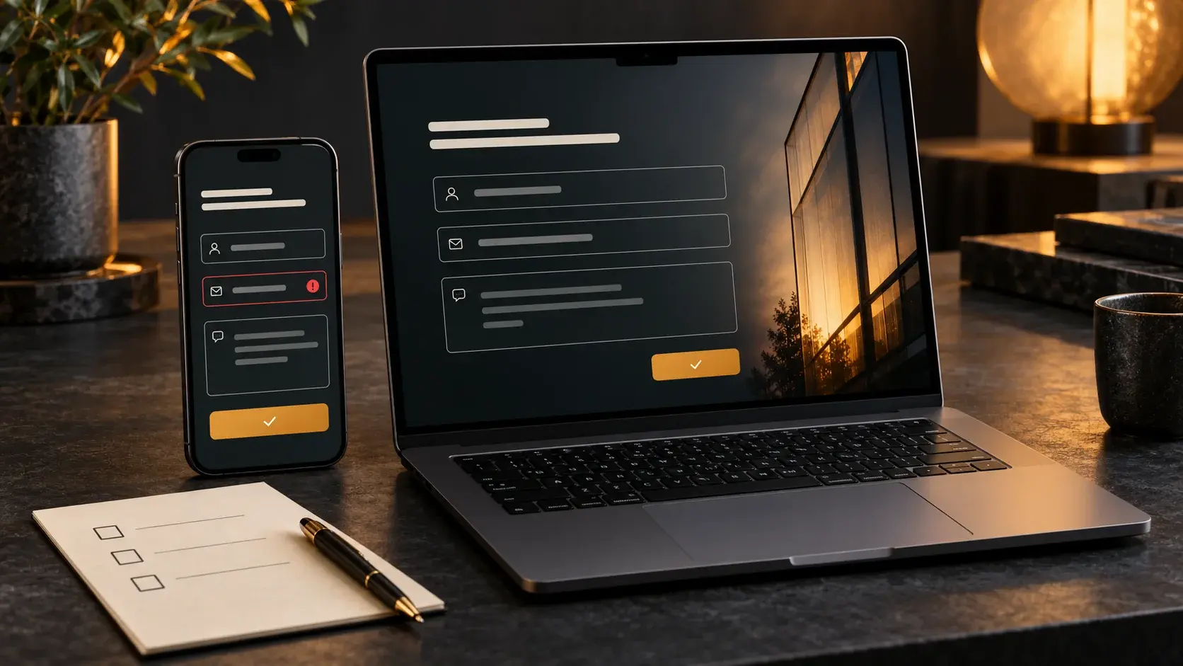
Ask for information needed for the first conversation. A contact method and short problem description are often enough; budget fields, attachments and further qualification should exist only when the receiving team uses them. Mark required fields, keep labels visible outside placeholders and explain errors beside the relevant field.
Agree who receives enquiries and how delivery is checked. An “enquiry sent” message does not demonstrate that a salesperson received a usable record. With website and business-system integrations, test contact details, the message, the source page and accidental duplicate submission. The website–CRM integration guide explains what to agree before connecting systems.
On a phone, telephone links should initiate a call, email links should open an email application and messenger links should reach the intended contact. Test keyboard navigation and the journey after optional cookies are declined. Avoid publishing response-time promises until the business can meet them consistently; explain the next step clearly instead.
Accept the website through realistic scenarios
Agree acceptance checks before development starts. Use the final copy, long service names and every language version. Empty wireframes cannot show how the completed page behaves on a small phone or a wide monitor. For each issue, record the URL, device, reproduction steps and expected result.
| Scenario | Acceptance criterion | Evidence |
|---|---|---|
| Find a service from the homepage | A clear route and a complete answer without a dead end | Tested journey and page list |
| Submit an enquiry | A correct record reaches the recipient and confirmation is clear | Time-stamped test enquiry |
| Make a form error | The issue is explained and entered data is retained | Required-field checks |
| Change language | The equivalent page opens | RU/RO/EN page and link comparison |
| Use different screens | No clipped copy or page-wide horizontal scrolling | Phone, tablet, desktop and wide-screen checks |
A lost enquiry, incorrect contact or inaccessible core service should block launch until corrected. Minor presentation issues can be handled separately by explicit agreement. Distinguish defects from later improvements, assign a retest owner and keep the accepted checklist so both sides understand what was delivered.
Make the structure searchable and maintainable
Give each main service a stable URL, one descriptive H1 and its own title and description. Connect pages with ordinary crawlable links and meaningful labels. Describe informative images with relevant alt text and leave decorative alternatives empty. For translated versions, check HTML lang, self-canonical URLs and reciprocal hreflang. When an address changes, redirect the old URL directly to the current destination.
The pre-launch SEO checklist provides a technical review sequence. Structured data should describe visible content rather than supply missing facts. Google’s guidance on helpful content is a useful reference for checking whether a page gives readers an independent answer instead of search-oriented filler.
After publication, assign ownership of service information, contacts and supporting material. Agree ongoing website support, including content updates, form checks, backups and change handling appropriate to the platform. The website remains useful when information stays current and the team actually handles the enquiries it receives.
