
A website for TIMELESS aesthetic medicine clinic
We designed the clinic website from the visual concept to a responsive design system, detailed treatment pages and appointment journeys. Its premium brand character is paired with a clear experience for patients.
The brief and project scope
TIMELESS brings together trichology, cosmetology and dermatology. The site needed to present treatments, specialists, equipment, products, certificates, patient stories and a training centre. We reviewed the previous site, project brief and content structure to guide visitors from their first introduction to a relevant treatment and consultation.
- Services
- Specialists
- Equipment
- Products
- Patient stories
- Training centre
Finding the visual concept
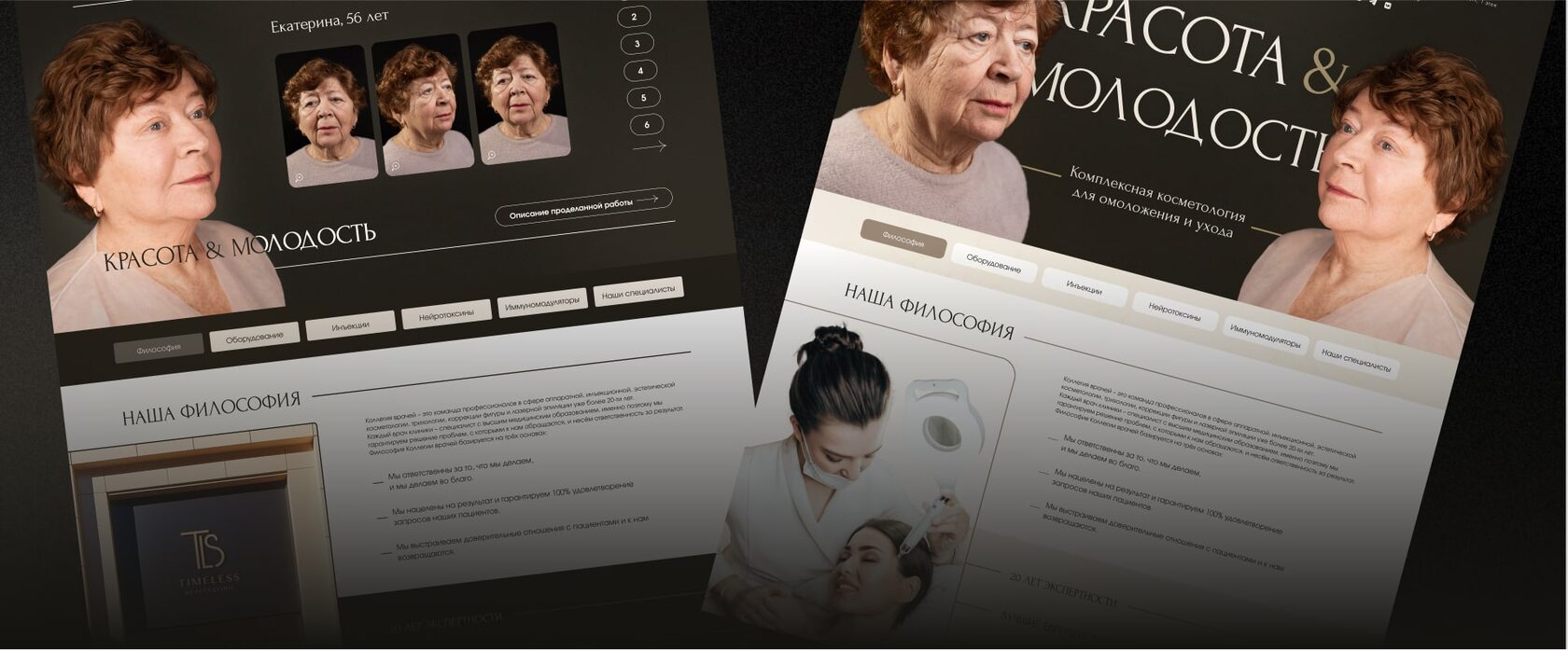
We first explored a light clinical direction with beige tones, specialist portraits and a sense of medical clarity. We then tested a more emotional approach using large photography and before-and-after video. After several iterations, we chose a dark aesthetic that better conveys the privacy and premium character of TIMELESS while giving treatment outcomes the strongest visual emphasis.
A homepage led by visible outcomes
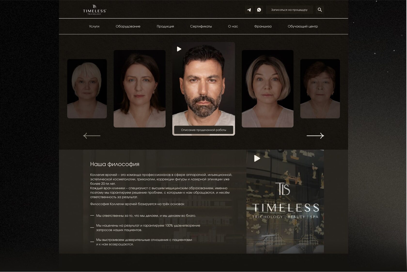
The opening screen centres on before-and-after video and patient stories. The following sections introduce the clinic philosophy and the specialists’ approach. Restrained navigation leads to treatments, equipment, products, certificates, clinic information and appointments.
Treatments: from discovery to consultation
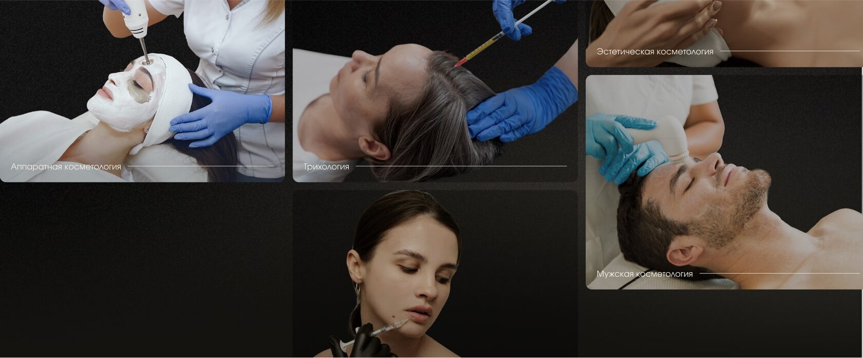
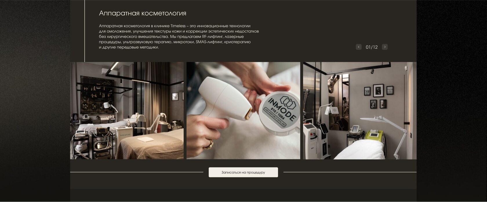
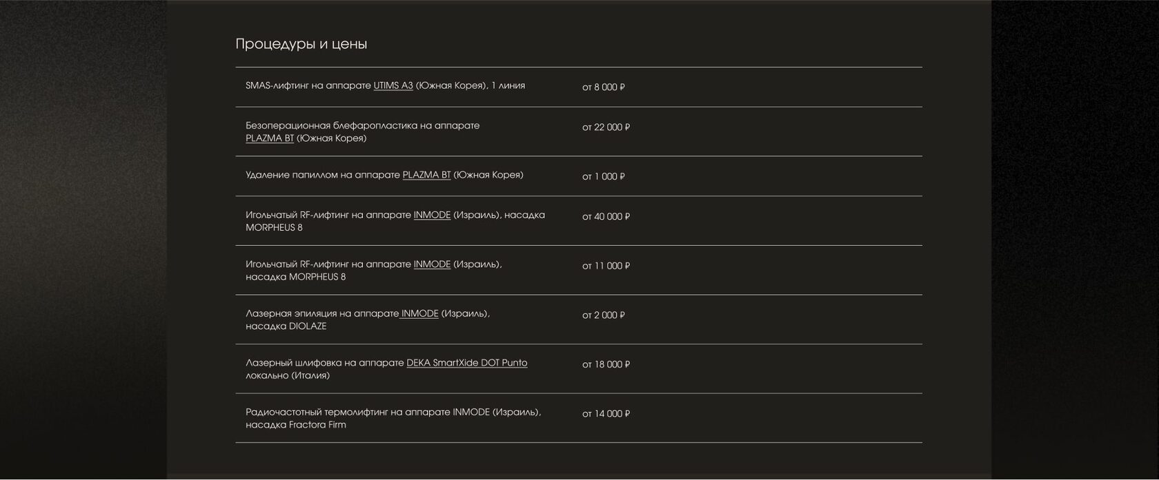
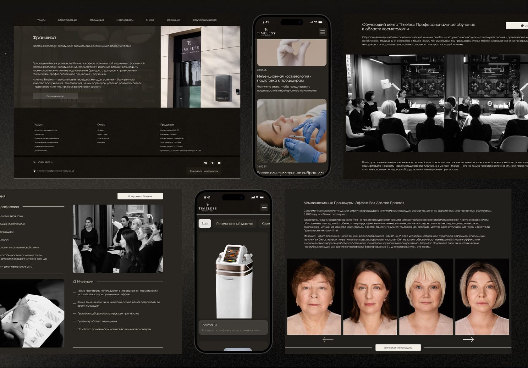
We replaced a long list with large photographic cards for trichology, aesthetic and men’s cosmetology, and dermatology. Each treatment page opens with an explanation and image slider, then presents procedures and prices as a clear list. Video stories and a route to consultation sit close to the decision point.
About the clinic: people and proof
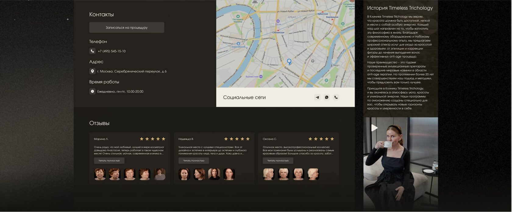
The page tells the TIMELESS story and introduces its doctors. Specialists, contacts, reviews, interiors, licences and video are arranged as progressive proof of expertise, so visitors can meet the people and see the space before getting in touch.
Patient stories
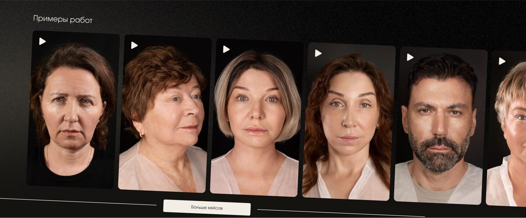
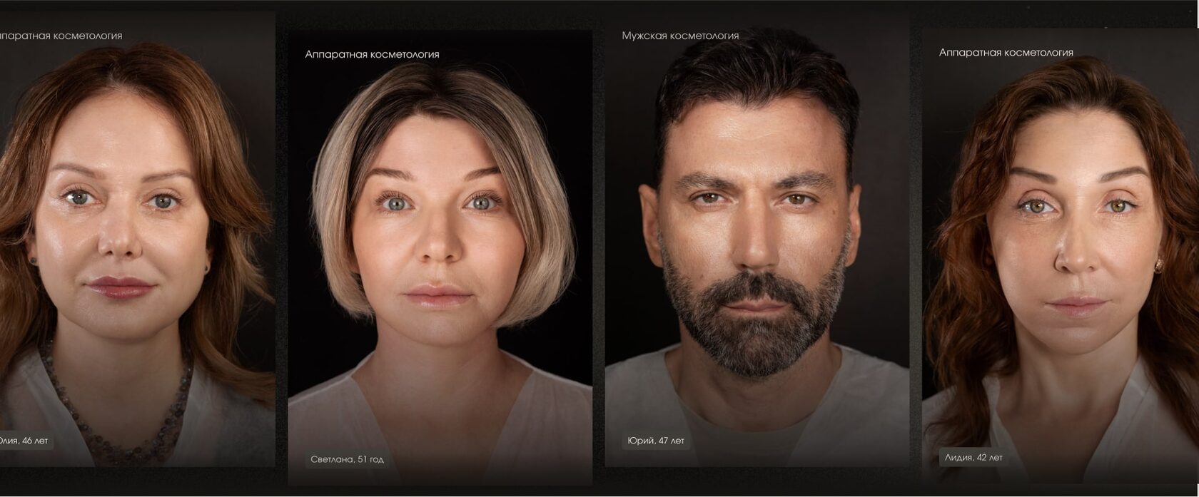
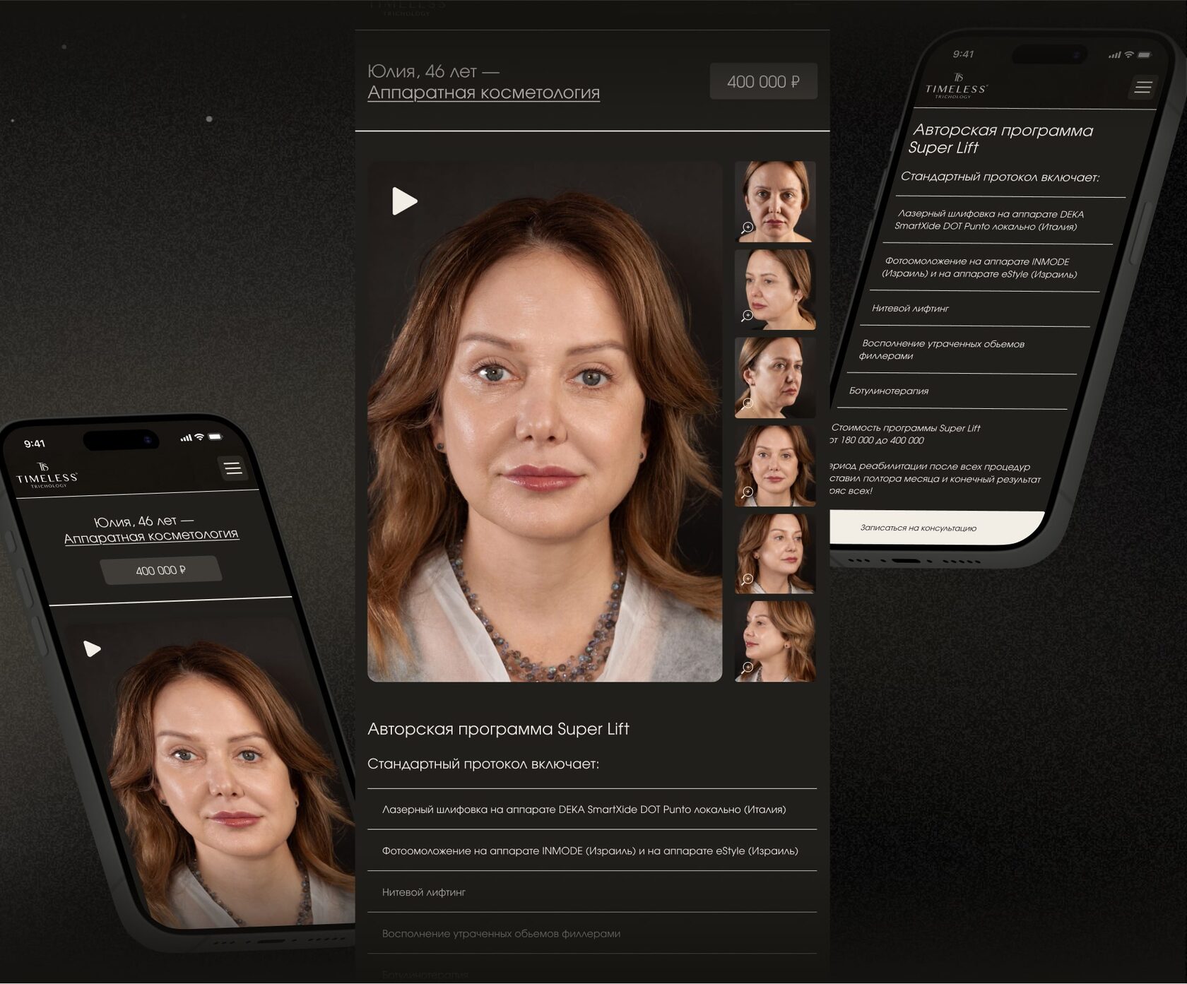
The patient section presents real cases with a treatment category, name, age and portrait. A detailed story can show before-and-after photo and video, the programme, procedures, price, recovery and booking route. Outcomes are shown in the context of the work behind them.
Professional products
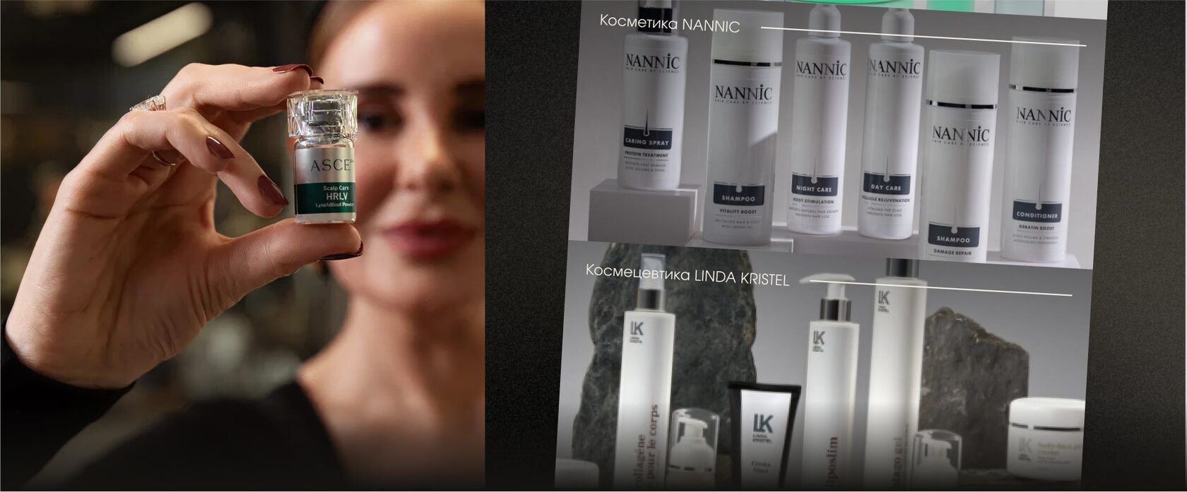
We presented professional skincare as a visual showcase, with large product photography and concise context. Dark backgrounds, subtle overlays and careful typography keep the cards aligned with the site identity.
Franchise, training and expert content
Potential partners receive a calm presentation of the franchise and cooperation terms. The training centre has its own journey, with class photography and programme information. The blog uses responsive article cards and a clear structure for expert content. On mobile, the brand atmosphere and fast access to booking remain intact.
Style guide and responsive system
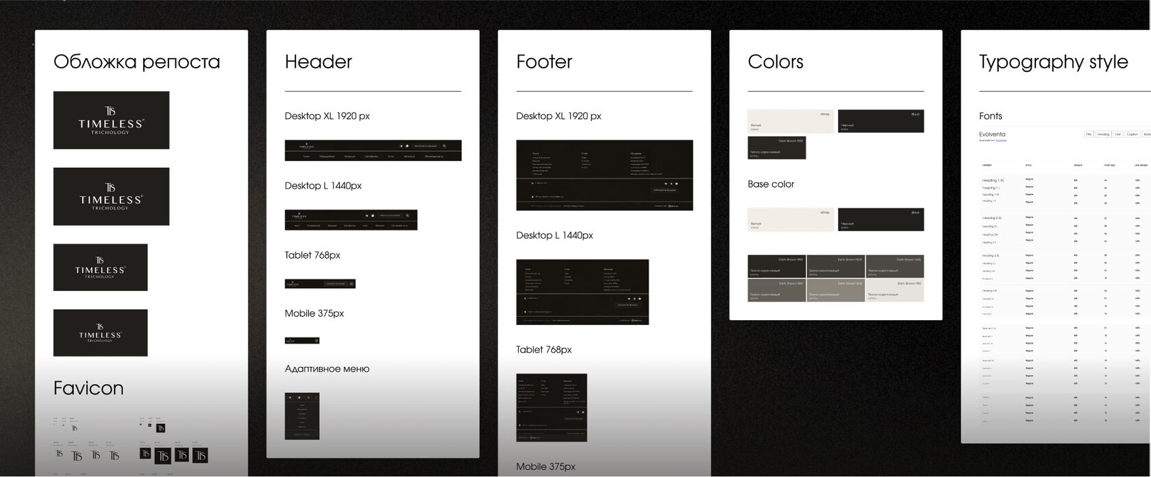
We documented colours, type, cover options, favicon, header and footer. We also specified states for buttons, forms, fields, tabs, accordions, cards, galleries, video and search. Desktop-to-mobile rules let the team grow the site without visual inconsistency.
Project outcome
TIMELESS gained a cohesive digital presentation with a clear patient journey and dedicated areas for partners and specialists. Its design system supports new treatments, patient stories and expert material without changing the visual language.
