

A minimalist online store for SOGGI
We refined the womenswear brand’s digital presentation with a dark visual system, large editorial imagery, a restrained catalogue and a responsive shopping journey.
The brief and context
The brief was to preserve SOGGI’s minimalism while making product discovery clearer. The interface needed to support strong fashion imagery and stay usable on mobile.
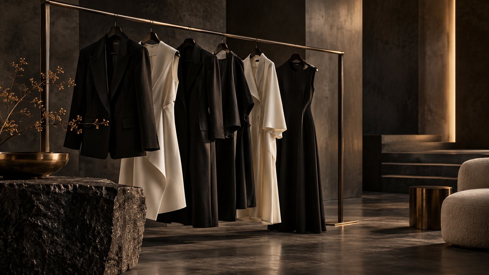
A darker visual direction
We reviewed the content hierarchy and rhythm. Dark surfaces, generous space and quiet typography put fabric, silhouette and styling first.

Catalogue and product page
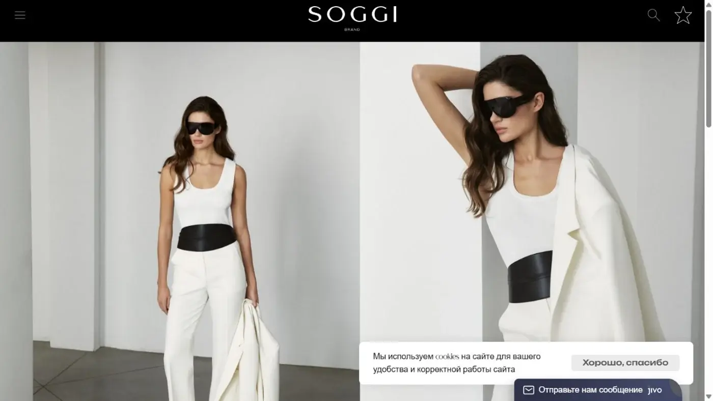
Categories and filters narrow the choice. Product imagery, key details and purchase action follow a clear sequence from inspiration to decision.
Responsive experience
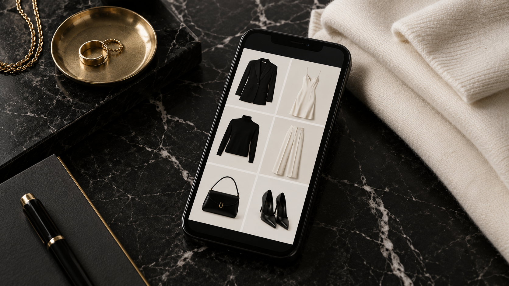
We checked navigation, product grids and purchase controls at smaller widths. Page structure and metadata provide a sound base for future content and search work.
What the project gained
The store now presents collections in a coherent visual language and gives shoppers a direct path from discovering the brand to selecting a product.
Let’s discuss your project
Tell us about your goals. We will propose a structure, visual direction and technical approach.
