
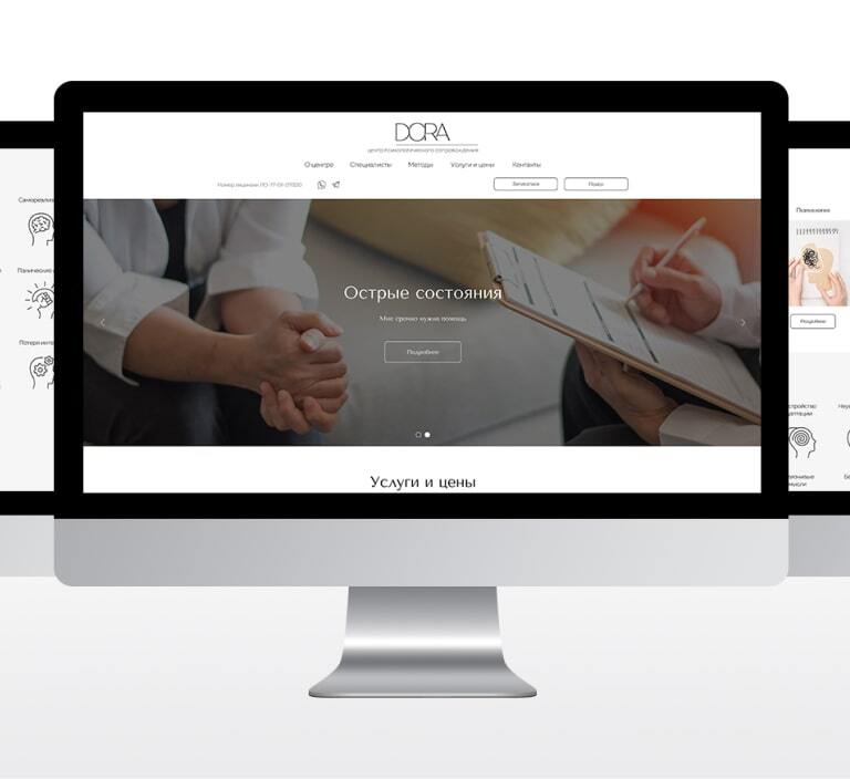
A clear support-centre website for DORA
We built a calm, informative and responsive site that helps visitors understand the centre’s services and move toward an appointment.
The brief and context
The brief called for an interface that is simple without feeling generic: concise navigation, an actionable opening screen, services, practitioners, methods, prices and contacts.
Homepage concept
A detailed brief shaped the opening slider and call to action, service areas, common reasons to seek support, a founder quote, an introduction to the centre, practitioner profiles and contacts.
Service and practitioner pages
After the homepage we focused on the pages closest to an enquiry: services, practitioners and methods. Each page keeps key information and the appointment route close together.
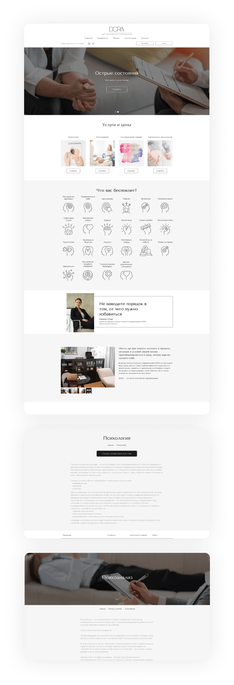
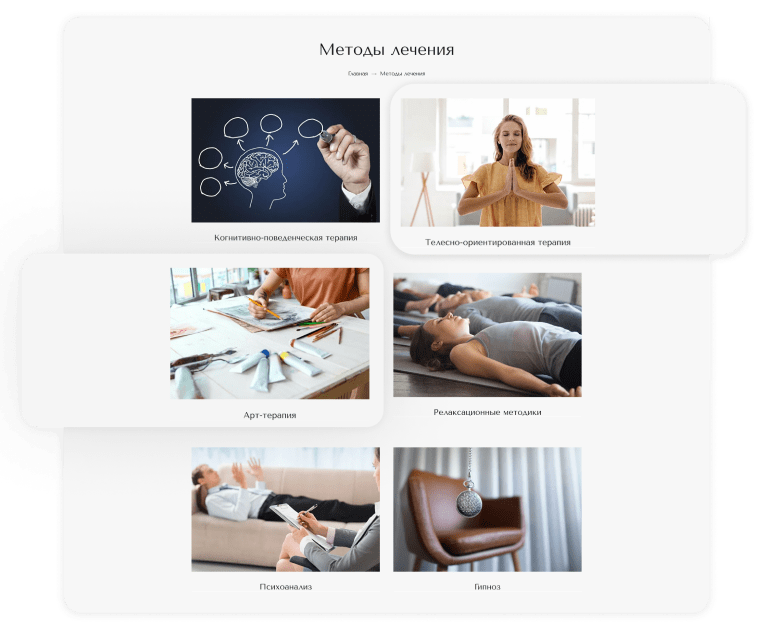
Methods, prices and trust
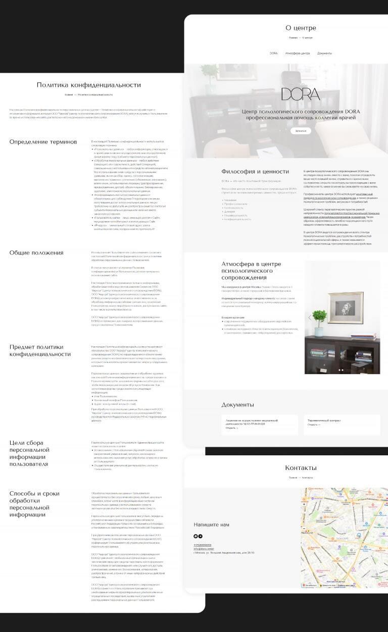
Method pages help visitors compare approaches, and pricing clarifies consultation terms. About, contact and privacy pages answer practical questions before someone reaches out.
Responsive build
We checked navigation, copy, imagery and forms across phone, laptop and large screens, keeping the centre’s calm tone in every format.
What the project gained
DORA gained a coherent website with clear paths to services, practitioners, treatment methods and booking.
Let’s discuss your project
Tell us about your goals. We will propose a structure, visual direction and technical approach.
